The Fragmented World of Health Tracking
The Fragmented World of Health Tracking
The modern user juggles numerous health applications: fitness trackers, calorie counters, medication reminders, and more.
Collating this scattered information often results in cognitive overload, decreased engagement, missed medications, and a reduced understanding of one's health.
The modern user juggles numerous health applications: fitness trackers, calorie counters, medication reminders, and more.
Collating this scattered information often results in cognitive overload, decreased engagement, missed medications, and a reduced understanding of one's health.


The Challenge
The Challenge
The Challenge
How could we design a unified dashboard that empowers users with actionable insights without overwhelming them?
How could we design a unified dashboard that empowers users with actionable insights without overwhelming them?
How could we design a unified dashboard that empowers users with actionable insights without overwhelming them?
Research & Discovery
Research & Discovery
For an integrated health dashboard like Crux, research isn't just the initial step; it's the backbone that informs every design decision.
Here's an overview of our research exploration for Crux.
For an integrated health dashboard like Crux, research isn't just the initial step; it's the backbone that informs every design decision.
Here's an overview of our research exploration for Crux.
User interviews
User interviews
User interviews
Objective: Understand users' pain points, health habits, and how they interact with health data.
Key findings: Frustration with disjointed health data & managing medications across multiple platforms.
Objective: Understand users' pain points, health habits, and how they interact with health data.
Key findings: Frustration with disjointed health data & managing medications across multiple platforms.
Competitive analysis
Competitive analysis
Objective: Gauge the market, identify gaps, and learn from competitors
Key findings: Lack of detailed medication management, holistic health views and cumbersome navigation.
Objective: Gauge the market, identify gaps, and learn from competitors
Key findings: Lack of detailed medication management, holistic health views and cumbersome navigation.
Objective: Gauge the market, identify gaps, and learn from competitors
Key findings: Lack of detailed medication management, holistic health views and cumbersome navigation.
Accessibility assessment
Accessibility assessment
Objective: Ensure Crux is universally usable, adhering to WCAG guidelines.
Key findings: Initial color schemes weren't optimal for users with visual impairments & some buttons were too close together, posing problems for those with fine motor challenges.
Objective: Ensure Crux is universally usable, adhering to WCAG guidelines.
Key findings: Initial color schemes weren't optimal for users with visual impairments & some buttons were too close together, posing problems for those with fine motor challenges.
Objective: Ensure Crux is universally usable, adhering to WCAG guidelines.
Key findings: Initial color schemes weren't optimal for users with visual impairments & some buttons were too close together, posing problems for those with fine motor challenges.
Stakeholder interviews
Objective: Garner insights from professionals - doctors, pharmacists, fitness experts.
Key findings: Doctors emphasized medication adherence for patient outcomes. Fitness experts noted that overwhelming users with too much data could be detrimental.
Objective: Garner insights from professionals - doctors, pharmacists, fitness experts.
Key findings: Doctors emphasized medication adherence for patient outcomes. Fitness experts noted that overwhelming users with too much data could be detrimental.
Objective: Garner insights from professionals - doctors, pharmacists, fitness experts.
Key findings: Doctors emphasized medication adherence for patient outcomes. Fitness experts noted that overwhelming users with too much data could be detrimental.
Dashboard- A Unified View
Dashboard- A Unified View
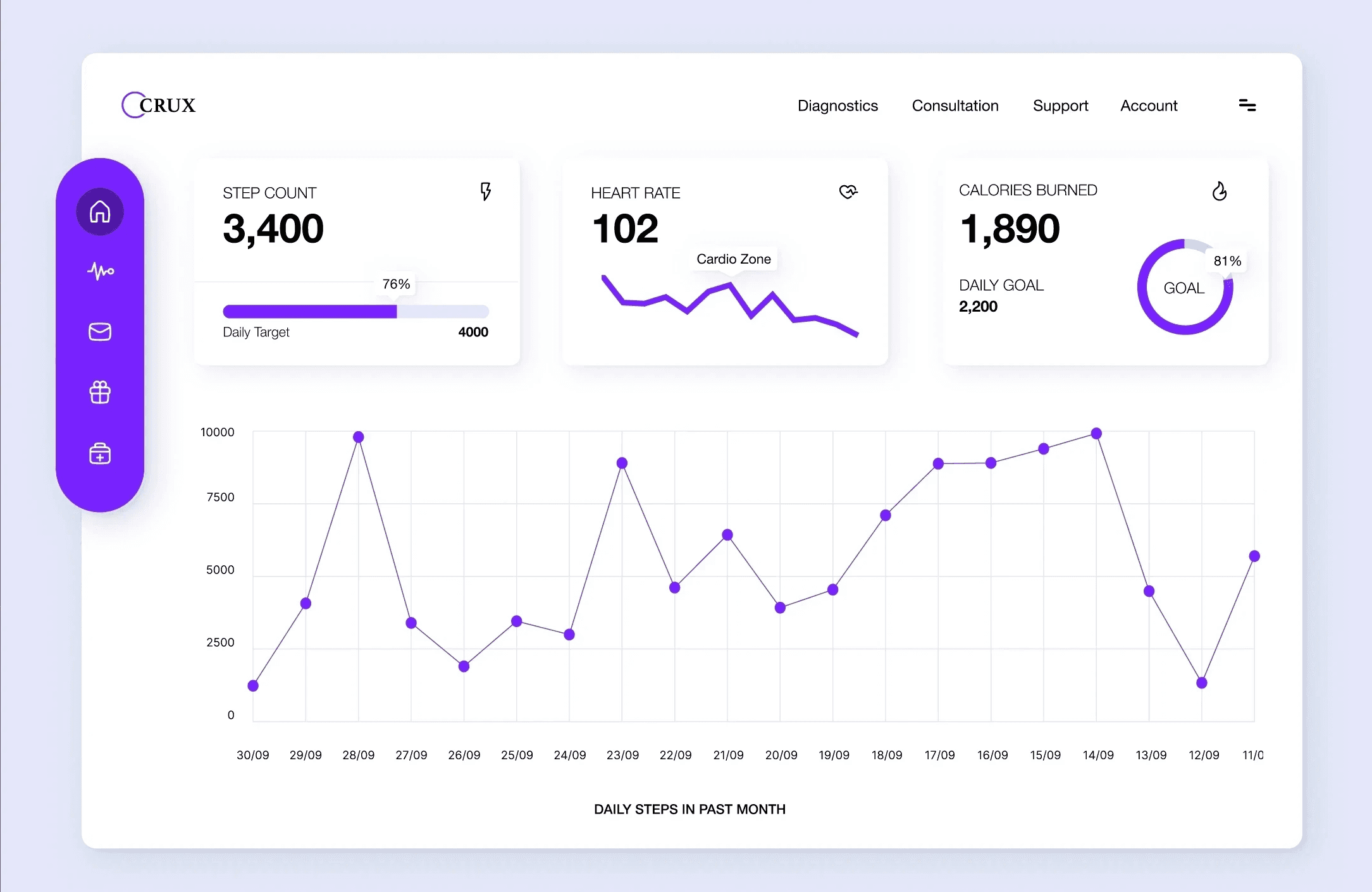

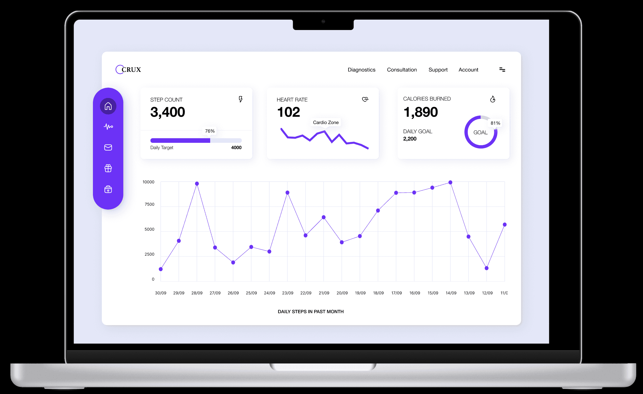
Side Navigation: Icons with labels ensured users could identify sections quickly. Our choices were:
Home: Central hub for daily data.
Messages: Doctor communications and health reminders.
Analytics: Deep dives into health trends.
Rewards: Gamifying health achievements.
Pillbox: A critical section for medication management.
Data Visualization
Step Count, Heart Rate, Calories: Progress bars with percentages provided a glanceable view.
Monthly Step Graph: A line graph showcased daily steps.
Header Navigation was chosen for features less frequently accessed yet crucial: Diagnostics, Consultation, Support, and Account.
Data Visualization
Step Count, Heart Rate, Calories: Progress bars with percentages provided a glanceable view.
Monthly Step Graph: A line graph showcased daily steps.
Header Navigation was chosen for features less frequently accessed yet crucial: Diagnostics, Consultation, Support, and Account.
Pillbox - Simplified Medication Management
Pillbox - Simplified Medication Management
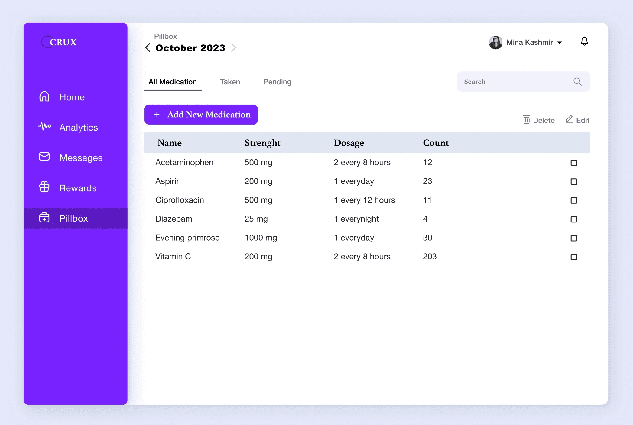
Tabs: Differentiation between 'All Meds', 'Taken Meds', and 'Pending Meds', offers users immediate clarity.
Table Design: Accessibility was paramount. Alternating row colors, large fonts, and clear column headers enhanced readability. An action column with checkboxes allowed users to mark off taken meds seamlessly.
Search & Archive: Users could swiftly locate medications and view past month's data, reducing cognitive load.
Lessons & Takeaways
Lessons & Takeaways
User-Centered Design: Our continuous feedback loop with users ensured we were solving real problems, not assumed ones.
Accessibility is Non-Negotiable: Designing for all users enhanced usability universally.
Balance: Striking the right balance between data density and simplicity was challenging but pivotal. We learned that sometimes, less is more.
